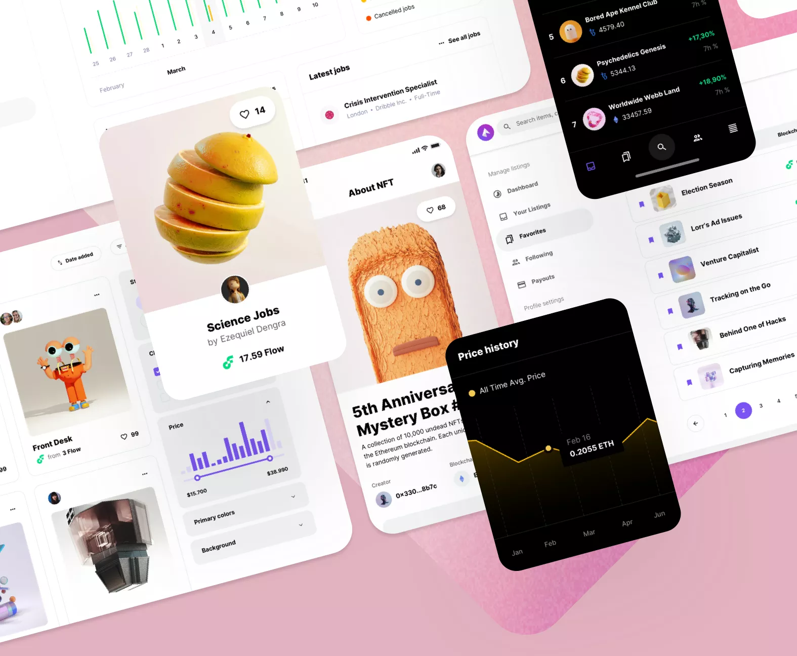
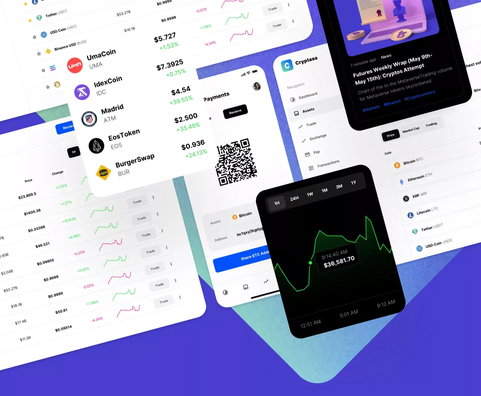
For developers and designers tackling complex web interfaces and demanding Software-as-a-Service (SaaS) applications, leveraging top-notch UI kits for Sketch and Figma is non-negotiable. Our specialized UI kits for Figma offer superior customizability and are perfectly aligned with the varied and fast-paced needs of modern startups. You can achieve unprecedented efficiency by working smarter with Figma's Auto Layout feature and starting faster with a fully pre-built design system incorporated directly into our design templates. Elevate the quality of your projects instantly with these easily adaptable user interface kits; simply modify the content, customize the styles, and adapt the underlying design system to make the final product truly your own.
Exploring the main benefits of integrating UI kits into your product design workflow reveals three primary strategic advantages. The first and most significant benefit is the dramatic acceleration of the design process. Everything required for a professional UI design—from basic components to complex modules—is already meticulously packaged within our graphics resources. The next crucial benefit is ensuring impeccable interface design consistency. All components within our products are carefully tailored for versatility, guaranteeing a unified look and feel across different use cases and screens. You can swiftly and easily create a cohesive design by editing the central master components and shared styles in both Figma and Sketch. Every file is delivered to you exceptionally well-organized out of the box.
The final, yet equally vital, benefit is the ability to focus almost exclusively on fine details and strategic thinking. We have invested the hours into creating an exhaustive library of foundational and complex elements, freeing you to concentrate solely on the final touches necessary to bring your digital project to completion. You can design highly interactive, sophisticated web mockups in just minutes without the laborious process of building countless different UI elements from scratch. Simply pick one of our premium graphics templates for Figma or Sketch and start developing your product today.
Beyond mere speed and aesthetics, premium UI kits serve as an indispensable bridge between the design team and the engineering team, creating a seamless and efficient handover process. A professional kit doesn't just contain visuals; it includes a tokenized, structured design system that translates directly into code variables (e.g., color tokens, spacing scales, typography ramps). This standardization dramatically reduces the communication overhead and margin for error during implementation, ensuring that the coded product is a pixel-perfect rendition of the design. When components are built with responsiveness and accessibility in mind—a standard feature in top-tier kits—developers save countless hours figuring out complex CSS or accessibility standards, like keyboard navigation or ARIA attributes. Furthermore, using a shared library of master components in Figma encourages the design team to think systematically, treating the interface as a system of reusable parts rather than a collection of static screens. This fosters a more scalable and maintainable codebase, solidifying the UI kit's role as a critical tool for minimizing technical debt and maximizing product agility.